Why the Global South Is Right to Push for the Equal Earth Map
Excerpt
For 457 years, Africa fit inside Greenland on paper. It never did in reality.
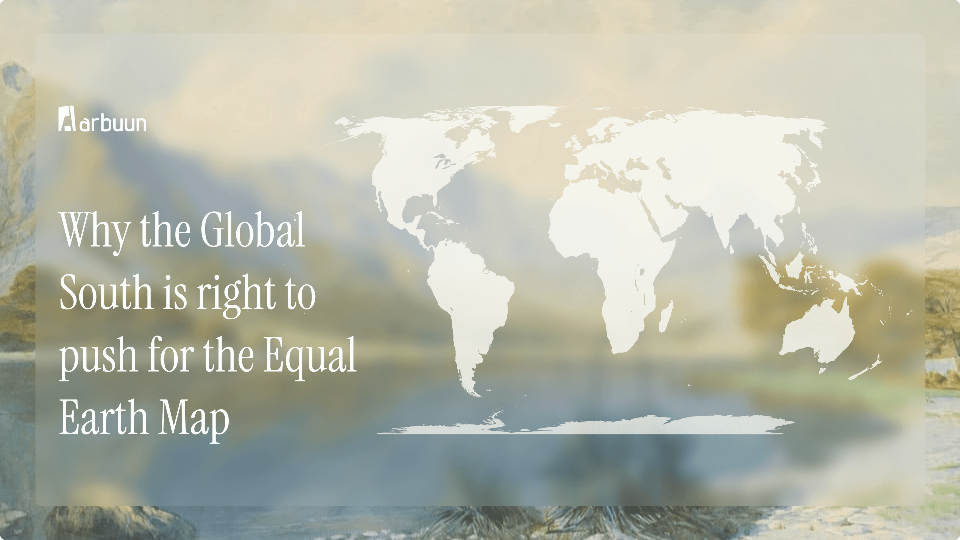
For 457 years, Africa fit inside Greenland on paper. It never did in reality, and that gap says a lot about how the world has been sizing up its own map.
The map we all grew up with
Most of us learned geography from the Mercator map. It was made in 1569 to help sailors navigate, great for plotting a straight line across the ocean, terrible for showing true size. The farther a place is from the equator, the bigger it looks on Mercator. So Europe, North America, and Russia balloon in size, while Africa, South America, India, and Southeast Asia shrink.
On September 4, 2026, the UN voted 164 to 1 to move away from Mercator and adopt something better: the Equal Earth map, designed in 2018. It shows every country and continent at its actual relative size. Nothing about borders or territory changes, just how big things look, which turns out to matter more than you'd think.
What is the Global South, and what actually changed for it
"Global South" is the term used for countries across Africa, Latin America, South Asia, and Oceania, regions that sit closer to the equator and have, for centuries, been on the losing end of how the world represents them. Together, they cover over 40% of the world's land.
Here's the simplest way to see what changed: on Mercator, Africa and Greenland look about the same size. In real life, Africa is 14 times bigger. India, the world's 7th-largest country, often looks smaller on a map than European countries a fraction of its size. Equal Earth just... fixes that. It shows things as they actually are.
Why this matters
It's easy to dismiss this as a map nerd's argument. But think about what a map actually does, it's often someone's first mental image of a place, long before they know anything else about it. If a country looks small, it gets treated as small, in ways that are hard to trace but easy to feel.
A few things follow from correcting that:
Kids learn a truer picture. Generations grew up thinking Africa was small. That's now changing in classrooms.
Outsiders read scale differently. Investors, journalists, diplomats, all of them carry some intuitive sense of "how big is this place" shaped by the maps they've seen. Accurate maps nudge that intuition closer to reality.
Institutions are already moving. UNESCO and UNICEF use equal-area maps in their own materials. The World Bank says it's phasing out Mercator on its web maps too.
It's part of a bigger political moment. For African nations especially, this sits inside a larger push to correct colonial-era distortions, the UN resolution itself calls it an act of cognitive justice.
The fight didn't start in 2026
This has been building for decades. Back in 1973, a historian named Arno Peters made his own map specifically to push back against Mercator's bias, it got picked up by UNESCO and UNICEF, though cartographers criticized it for badly stretching country shapes.
Then in 2017, Boston's public schools switched their classroom maps to show true size, which reignited the whole debate. That's actually what led three cartographers to design Equal Earth in 2018, they wanted something that fixed the size problem without the shape problem.
More recently, two African advocacy groups, Africa No Filter and Speak Up Africa, ran a campaign called "Correct the Map." The African Union, representing 55 countries, backed it in 2025. A year later, Togo brought it to the UN, and 164 countries voted yes. Only the US voted no, calling it ideological. A handful of countries abstained over an unrelated issue involving how the map shows disputed territory in Ukraine.
Where this leaves us
None of this moves a single border or changes what a country actually owns. What it changes is the lens people use to judge scale, risk, and importance, and that lens matters more than we usually admit. Whether it's a continent or a single site, decisions are only as good as the picture you're working from. Getting the picture right isn't symbolic. It's the first step.
A map that shrinks a continent for 450 years teaches a false sense of scale. The same thing happens at a city block — when the data is wrong, so is every decision built on it.
Arbuun is building the reference layer for due diligence in Indian urban development, starting with the data most site evaluations still lack.